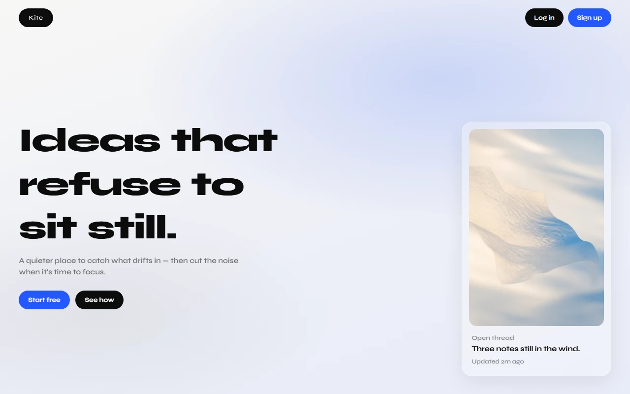
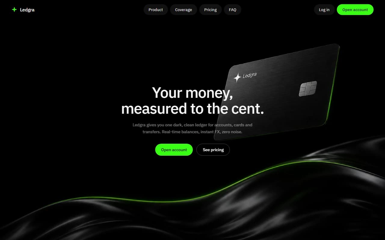
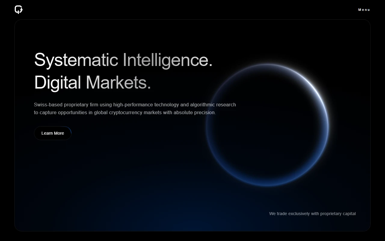
This case study presents a concept demonstration for portfolio purposes. It is not an active commercial product, operating company, or regulated service. The site shown here is available for purchase in its current form. say hi to discuss availability and terms.
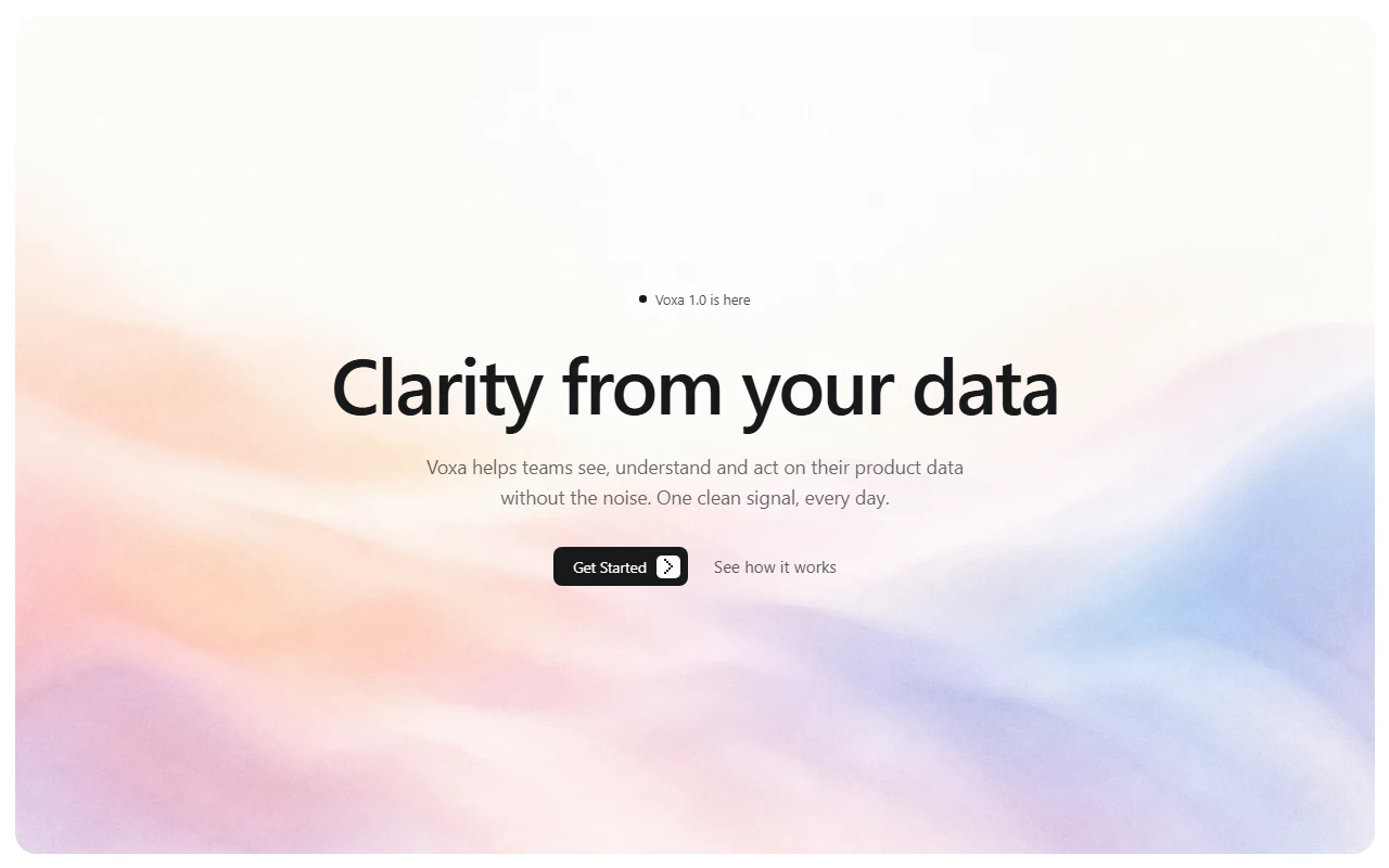
voxa
2026personal marketing site for a fictional analytics product that turns noisy dashboards into one clear daily signal. a full design and front end demo i built, not a live company or shipped saas.
- role
- design & front end
- stack
- html
- css
- javascript
overview
voxa is a fictional product site i built from scratch as a design and front end exercise. the pitch is simple. most product teams drown in dashboards, so voxa imagines a quieter alternative: one clear signal a day instead of another wall of charts.
this is not a shipped saas, not a client engagement, and not a funded startup page. it is a personal concept i designed and coded alone to explore how a serious b2b product could feel if the marketing site stayed calm, sharp, and a little opinionated.
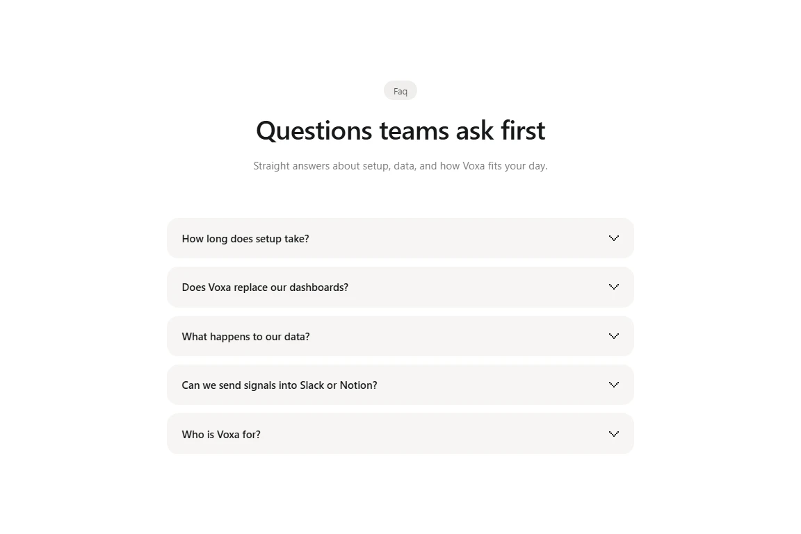
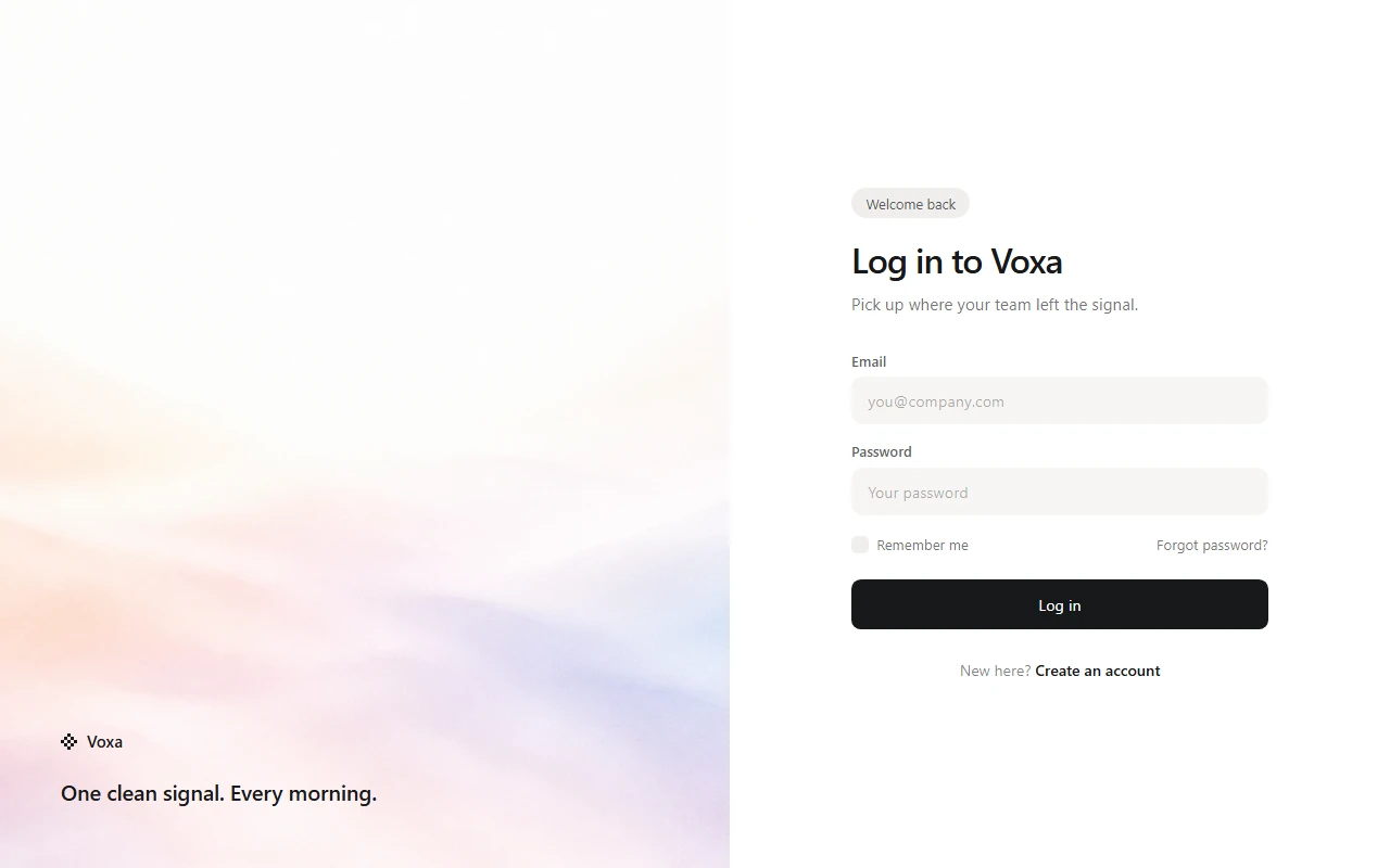
the site includes a full landing story, product sections, use cases, pricing, faq, blog article shells, and a fake login surface. everything is hand built html, css, and javascript. no framework, no cms, no backend. the point was craft, pacing, and product language, not production infrastructure.
what it is
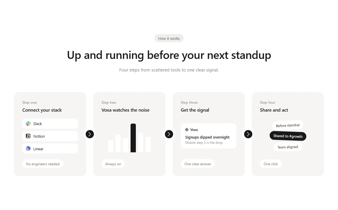
voxa pretends to be a product data companion for growth and ops teams. the fictional product promises a daily signal, a way to ask follow up questions, and a clean path from insight to action in tools like slack.
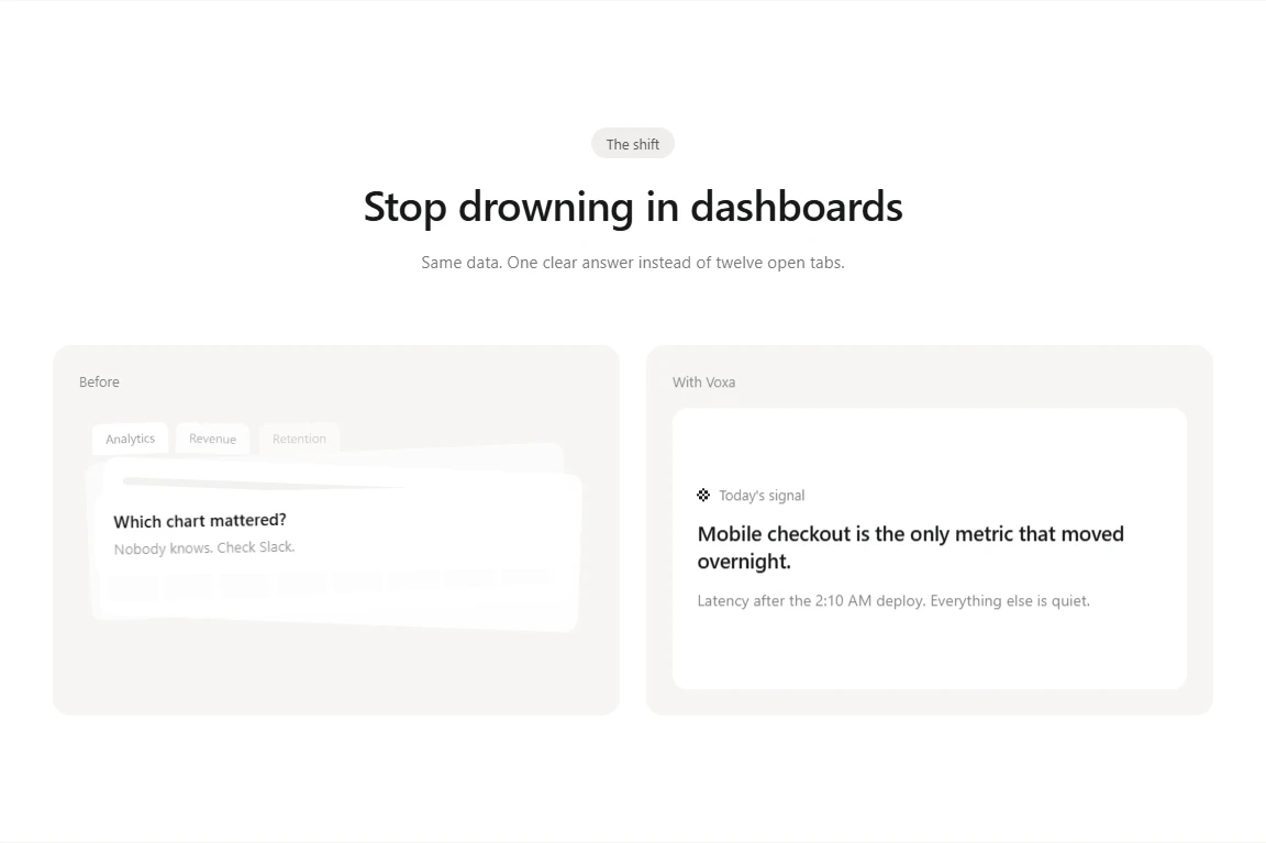
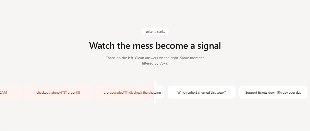
the marketing site has to sell that idea without turning into dashboard cosplay. so the page leans on narrative sections: a day with voxa sequence, before and after contrast, a noisy feed that settles into clarity, use case worlds, pricing, and a short blog index. each block is a designed scene, not a generic feature grid with icons slapped on.
visually the brand stays tight. dark mark, quiet type, crisp cards, and motion that supports the story instead of decorating it. the hero uses a soft ripple canvas. later sections reveal on scroll. nothing shouts.
how i built it
i treated it like a real product site even though the product is imaginary. that meant writing actual copy, inventing coherent feature names, and making the fake login feel intentional instead of abandoned.
structure stayed static on purpose. html pages for the marketing surface and account shell. css split by section so each chapter could evolve without turning into one giant stylesheet. small javascript modules for navbar behavior, scroll reveals, the day sequence, and the hero canvas.
working this way kept the feedback loop fast. change a section, refresh, judge the rhythm. no build pipeline arguing with the design. the constraint was the point: if the story only works after three frameworks and a design system, it probably was not clear enough yet.
design notes
the hardest part was tone. analytics marketing loves urgency and clutter. i pushed the other direction: fewer claims, stronger hierarchy, and enough empty space that the product idea can breathe.
the day with voxa section is the emotional center. it walks through alert, ask, and share as a sticky narrative so visitors feel a morning with the product instead of reading a feature list. the contrast block makes the same argument in two columns. before is messy. with voxa is focused.
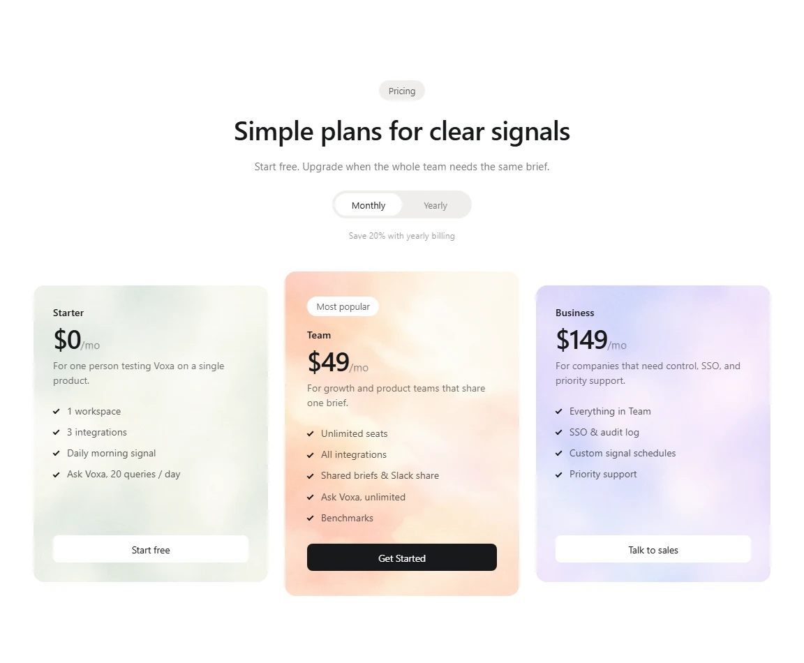
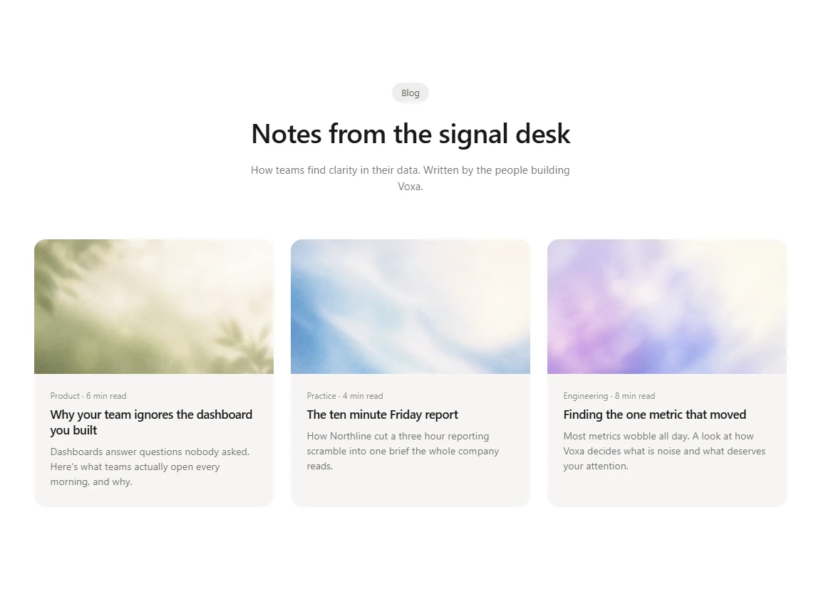
pricing and faq stay honest about the fiction. they are there to complete the site grammar of a product page, not to collect cards. the blog stubs exist so the information architecture feels grown up: a product like this would publish, so the shell is ready even if the company behind it is not real.
what this is not
voxa is not live software. there is no real data pipeline, no auth provider, no billing, no customers. the login page is a prop. the metrics on screen are invented. if you click around expecting a working product, you will meet a carefully built demo.
think of it as a portfolio piece and a practice ground. a place to test layout judgment, product storytelling, and front end polish without the noise of a real launch. that honesty matters. the craft is real. the company is not.
outcome
i ended with a complete static marketing world for a product that only exists on the page. that was the goal. it clarified how much of a product site is writing and pacing, how motion can explain an idea better than another icon row, and how far plain html and css can go when the concept is clear.
voxa stays as a reference: a personal design i made alone, finished enough to show, clear enough to say out loud that it is a mock.
disclaimer
The information on this page is provided for general portfolio and informational purposes only. No representation or warranty is made as to its accuracy, completeness, currency, or correctness, and no reliance should be placed on it as advice or as a statement of fact. All content is offered without guarantee and may be updated or corrected at any time without notice.