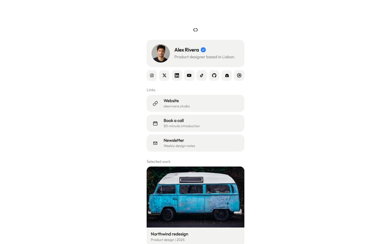
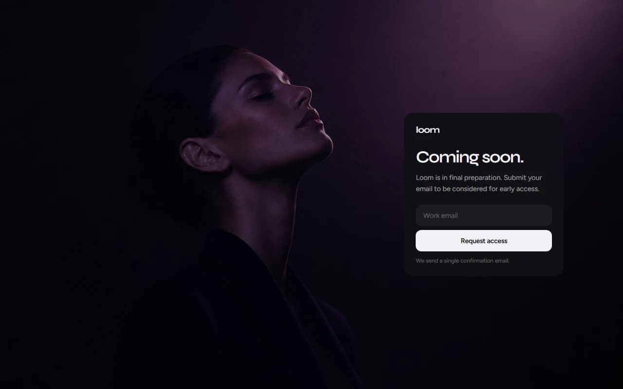
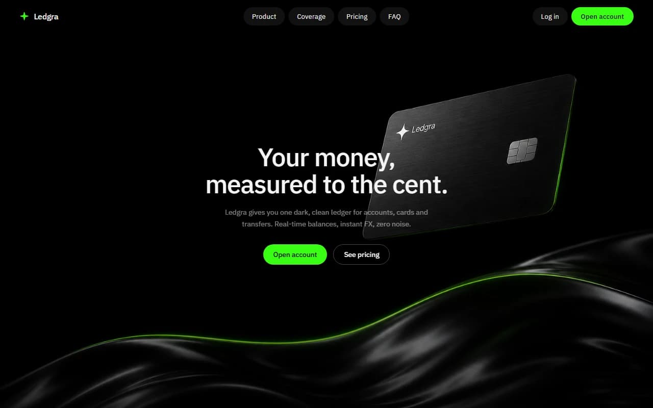
This case study presents a concept demonstration for portfolio purposes. It is not an active commercial product, operating company, or regulated service. The site shown here is available for purchase in its current form. say hi to discuss availability and terms.
kite
2026personal marketing site for a fictional calm ideas tool. catch half formed thoughts, hang with the mess, then cut to the one thread worth keeping. a design and front end demo i built, not a live product.
- role
- design & front end
- stack
- html
- css
- javascript
overview
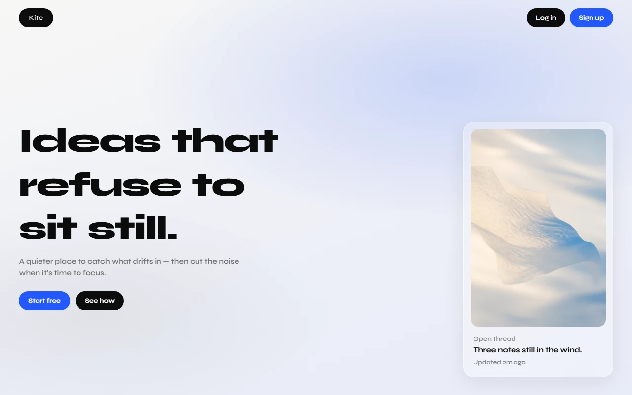
kite is a fictional product site i built around a simple mood: ideas that refuse to sit still. the product pitch is a quieter place to catch what drifts in, sit with the mess for a moment, then cut the noise when it is time to focus.
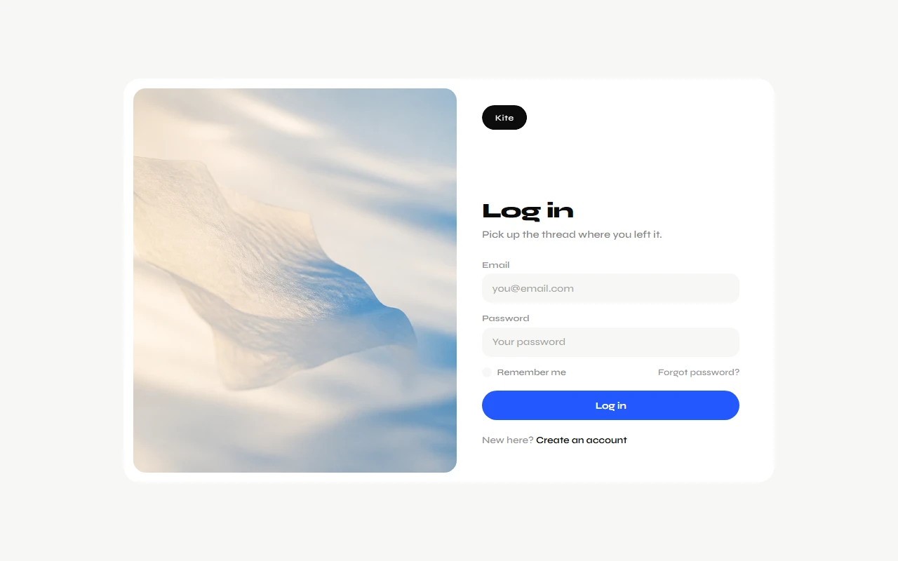
this is not a shipped app, not a client engagement, and not a real company. it is a personal concept site. login and signup are props. the copy is invented. the work is design and front end craft: pacing, hierarchy, and a full marketing arc that feels intentional without pretending the product exists.
what it is
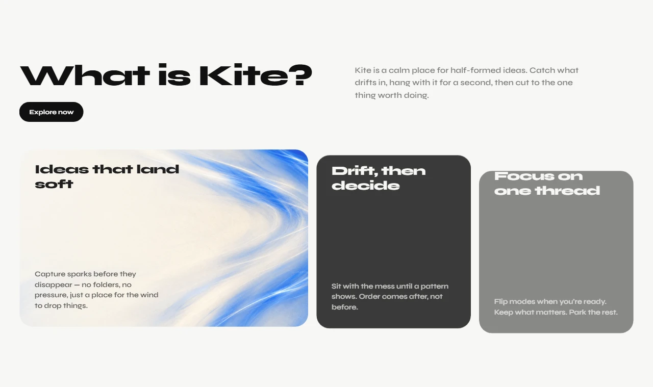
kite imagines a calm tool for half formed ideas. scraps land soft. you hang with them until a pattern shows. then you keep one thread and park the rest. the site sells that loop through a strong hero, a bloom section that explains the product, stacked scenes for how kite moves, a shift sequence for catch hang cut, pricing, and a short close.
visually it leans bright and editorial. syne carries the display type. the brand mark is a small pill with the word kite cut out of it. glass cards, soft photography, and large type do most of the talking. motion stays light so the page feels airy instead of loud.
how i built it
i built kite as a static site so iteration stayed fast. html for structure. css split by section. javascript for small interactions and scroll reveals. no framework, no backend, no fake api.
the goal was a complete marketing surface: hero, product story, process, pricing, and account shells. if a section only worked after a heavy stack, it was not clear enough yet. plain front end forced every block to earn its place.
design notes
productivity marketing loves checklists and urgency. kite goes the other way. fewer claims. more room. type that carries emotion. photography that feels like air, not stock office energy.
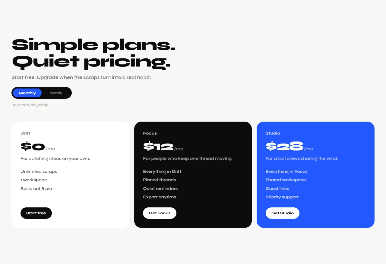
the catch hang cut sequence is the spine. it has to feel like a method without becoming a tutorial. pricing stays simple: drift, focus, studio. enough structure to read as a real product page, clear enough that the fiction stays honest.
what this is not
kite is not live software. there is no real capture engine, no accounts backend, and no team product behind the plans. if you click through expecting a working ideas app, you will meet a carefully built demo.
that honesty is part of the piece. the site is here to show design judgment on a soft product category: attention, focus, and unfinished thoughts. the company is imaginary. the craft is not.
outcome
i ended with a complete static marketing world for an ideas product that only exists on the page. it pushed how i handle large type, quiet motion, and long landing rhythm. kite is a personal mock i finished enough to show, clear enough to say out loud that it is not a real product.
disclaimer
The information on this page is provided for general portfolio and informational purposes only. No representation or warranty is made as to its accuracy, completeness, currency, or correctness, and no reliance should be placed on it as advice or as a statement of fact. All content is offered without guarantee and may be updated or corrected at any time without notice.