qt capital
2026marketing site for a swiss proprietary trading firm. systematic crypto infrastructure story across trading, technology, and company, built for clarity and precision.
awwwards
This project received honorable mention. You can view the recognition and related details on the linked page.
- role
- design & front end
- stack
- next.js
- typescript
- css
overview
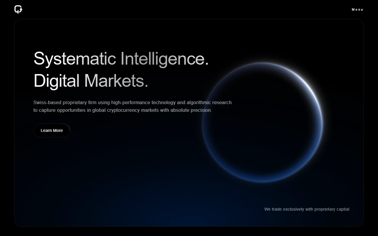
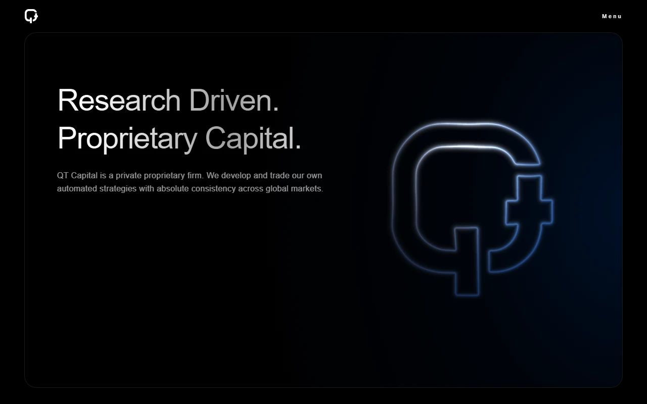
qt capital is a live marketing site i built for qt capital ag, a swiss proprietary firm focused on systematic digital trading. the site has to explain a serious operation without sounding like a crypto brochure: low latency infrastructure, algorithmic research, and proprietary capital only.
the work spans the full public surface. home, trading, technology, company, and contact. each page carries a clear chapter of the firm: what they trade, how the stack works, who they are, and how to reach them.
what it is
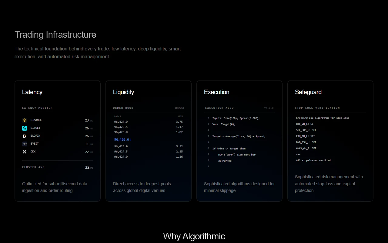
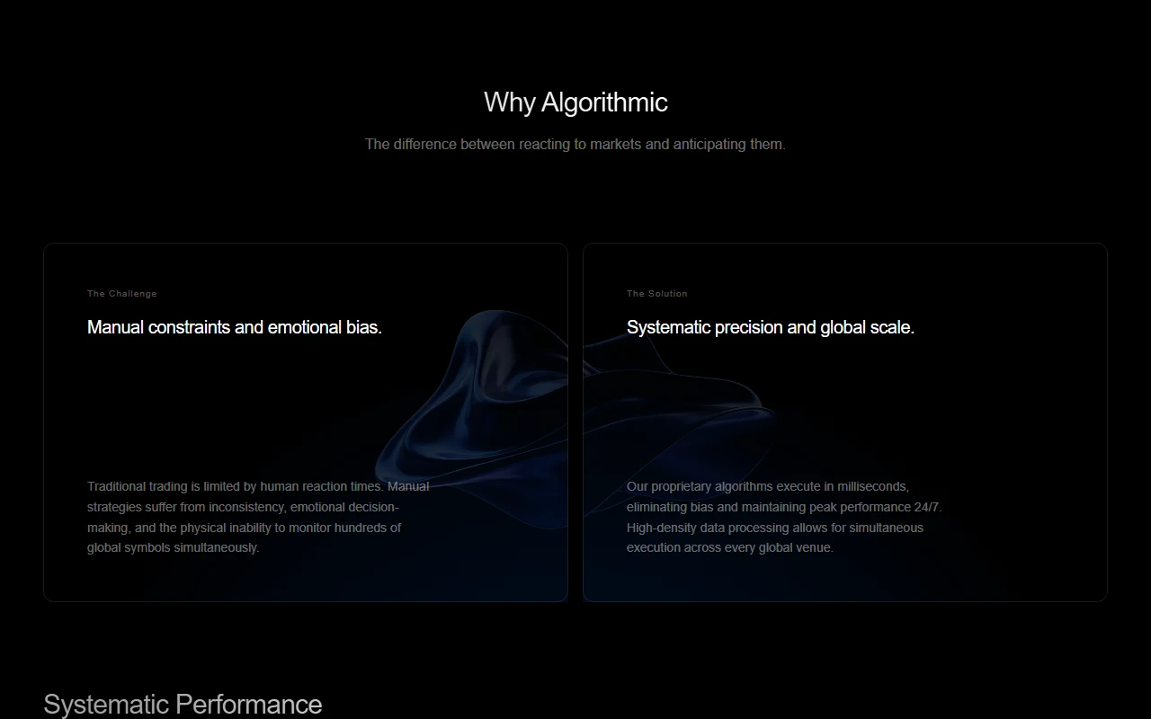
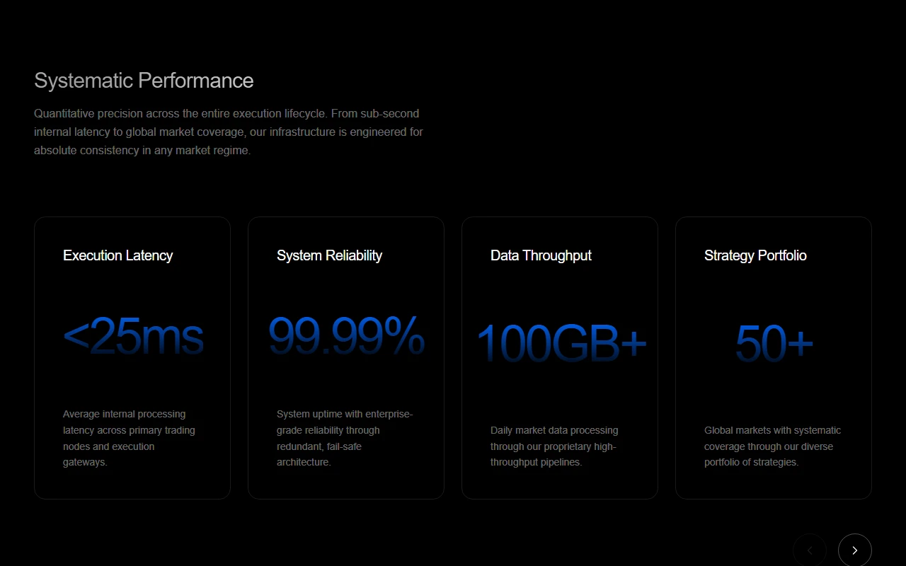
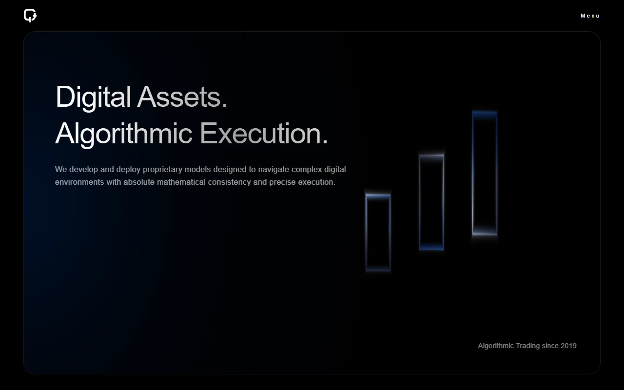
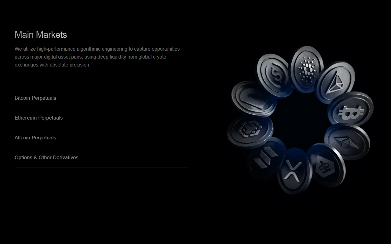
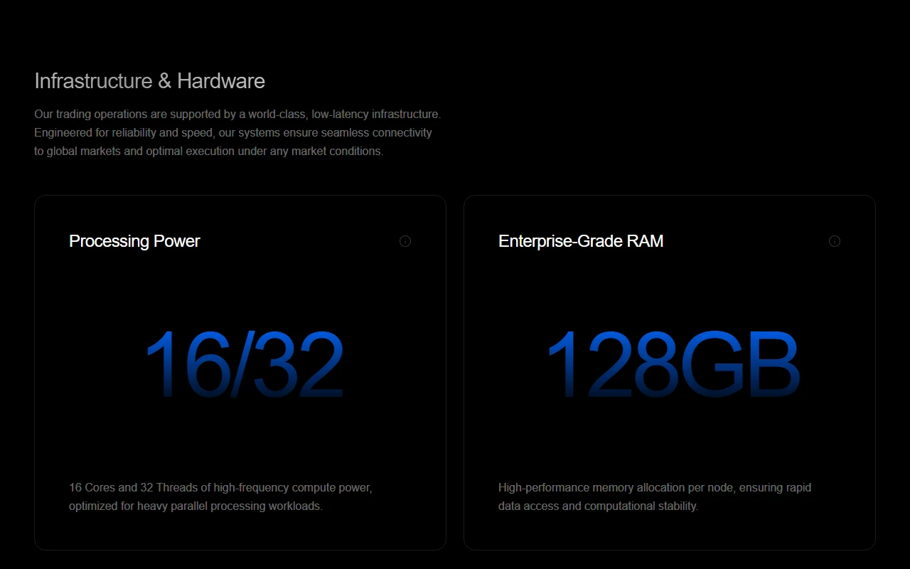
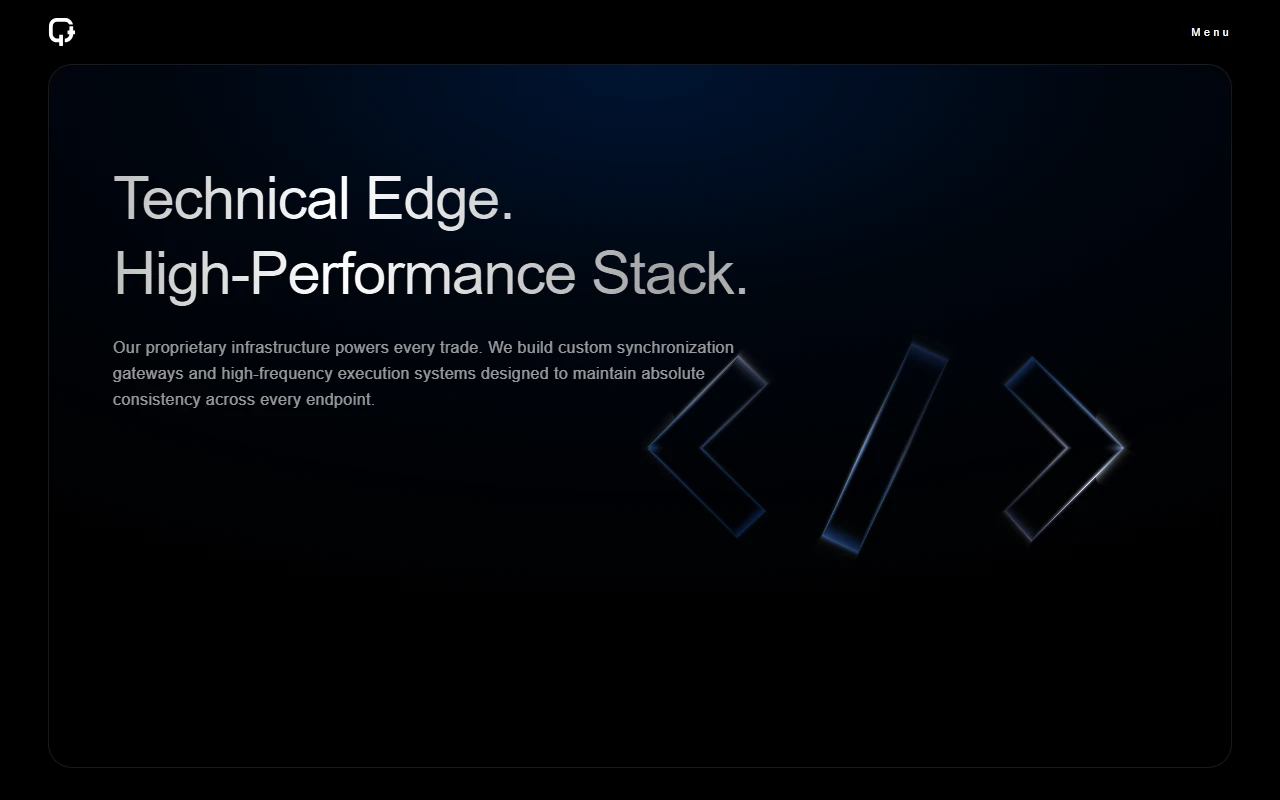
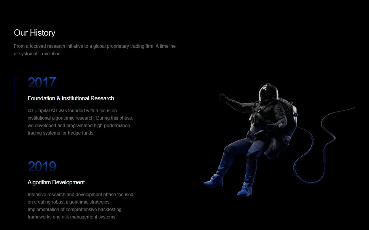
the home story opens on systematic intelligence for digital markets, then walks through trading infrastructure, why algorithmic execution matters, and performance markers that stay concrete. trading goes deeper into research, markets, and hardware. technology covers the stack, unified architecture, latency, and redundancy. company holds history, philosophy, and approach. contact keeps the ask short.
visually the site stays dark, sharp, and institutional. large type, quiet motion, and product style panels for latency, liquidity, and execution. the goal is confidence without noise.
how i built it
i built the site in next.js with a section driven layout so each chapter could move independently. pages stay focused. components carry the denser product scenes. motion and scroll behavior support the story instead of decorating it.
the hard part was tone and information density. a prop trading firm needs enough technical signal to feel real, and enough air that a visitor can still follow the page. every section had to earn its place.
design notes
fintech and crypto marketing often swings between hype and clutter. qt capital needed the opposite: swiss precision, clear hierarchy, and claims that read like operations language.
infrastructure panels, performance grids, and timeline chapters do most of the explaining. copy stays direct. chrome stays light. the brand should feel like a desk that runs all day, not a launch landing page chasing attention.
outcome
the result is a complete public site for a real proprietary trading firm. it gave me a full pass at institutional product storytelling, multi page architecture, and the kind of quiet density that serious finance work needs.
disclaimer
The information on this page is provided for general portfolio and informational purposes only. No representation or warranty is made as to its accuracy, completeness, currency, or correctness, and no reliance should be placed on it as advice or as a statement of fact. All content is offered without guarantee and may be updated or corrected at any time without notice.