This case study presents a concept demonstration for portfolio purposes. It is not an active commercial product, operating company, or regulated service. The site shown here is available for purchase in its current form. say hi to discuss availability and terms.
ledgra
2026personal marketing site for a fictional multi currency ledger and metal card product. dark, quiet money ui with live balances, fx, and a full pricing story. a design and front end demo i built, not a real bank.
- role
- design & front end
- stack
- html
- css
- javascript
overview
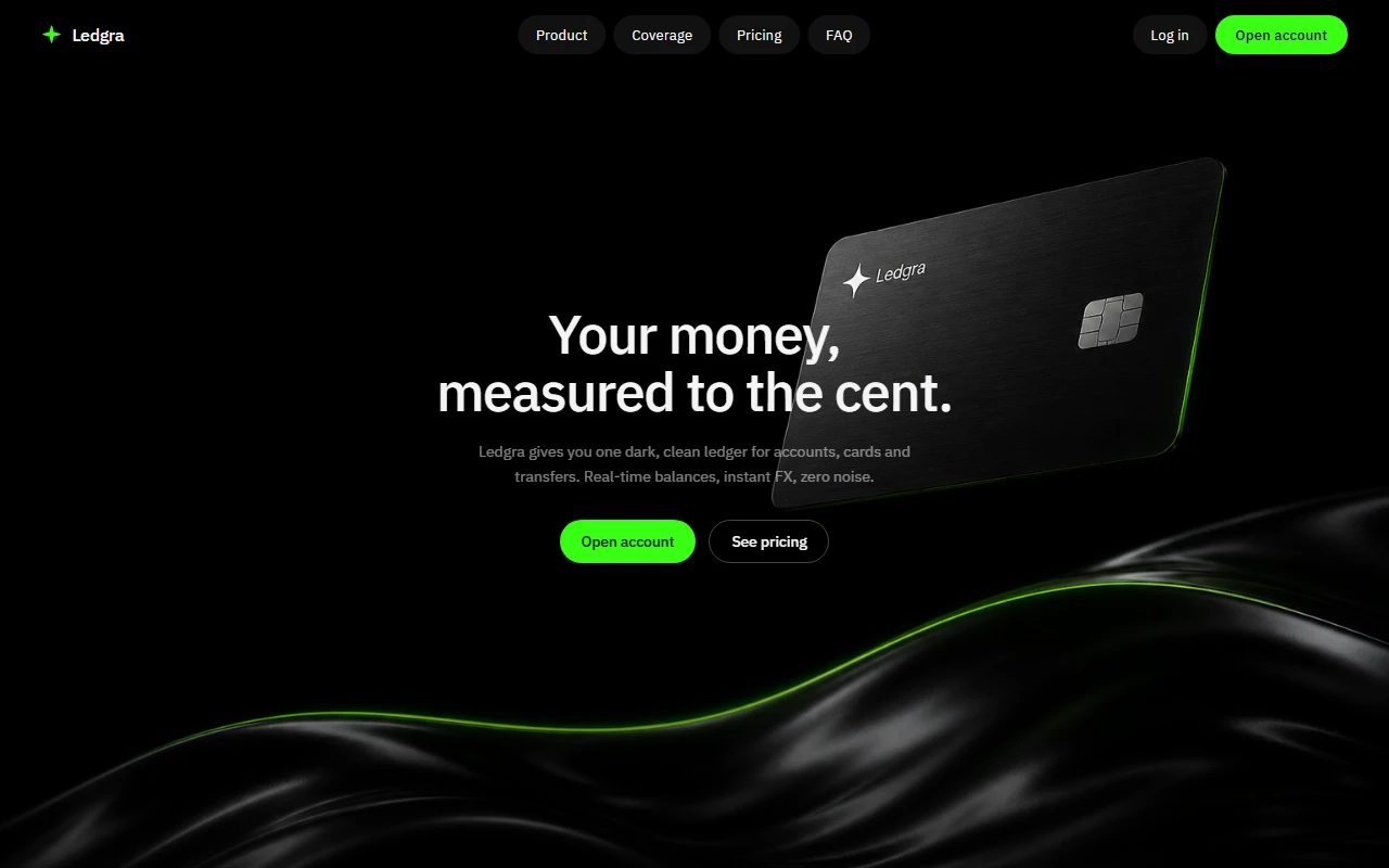
ledgra is a fictional fintech marketing site i built to explore how a money product could feel if it stayed dark, quiet, and precise. the line on the hero says it: your money, measured to the cent. the whole page is built around that mood. one clean ledger for accounts, cards, and transfers, with real time balances and instant fx, and almost no visual noise.
this is not a licensed bank, not a client project, and not a live financial product. it is a personal concept site. the login and register screens are props. the numbers are invented. the craft is what matters: product language, layout, motion, and a full marketing arc that feels grown up without pretending the company exists.
what it is
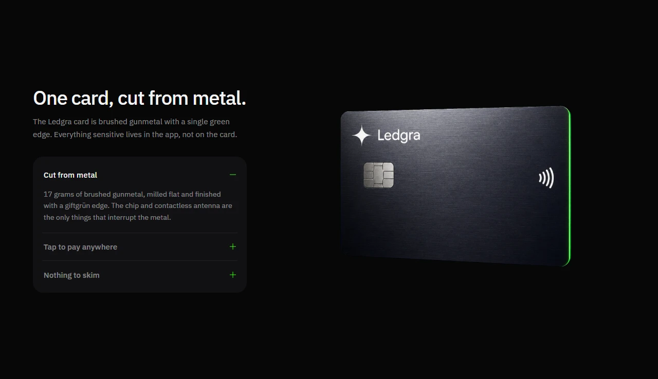
ledgra sells the idea of a calm multi currency wallet. hold balances in one place, convert at mid market rates, send across borders, and carry a brushed metal card that prints nothing sensitive on the surface. details live in the app. freeze is one tap. security copy stays boring on purpose.
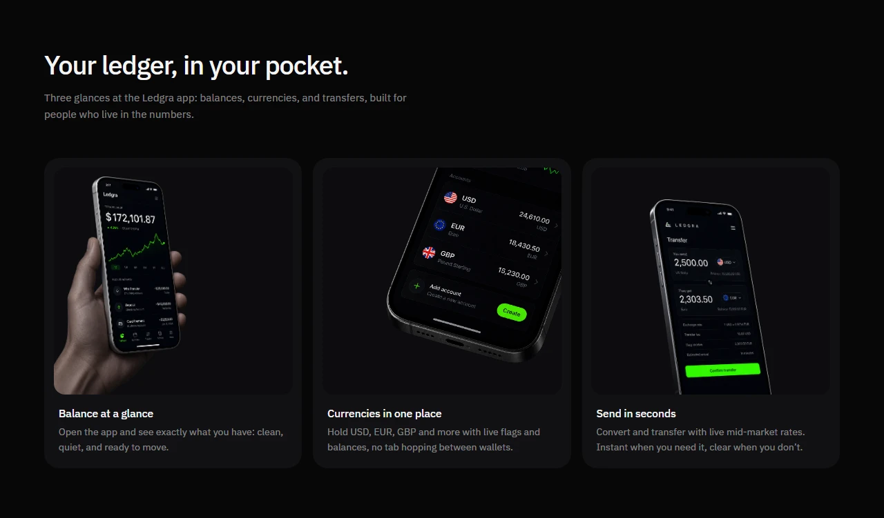
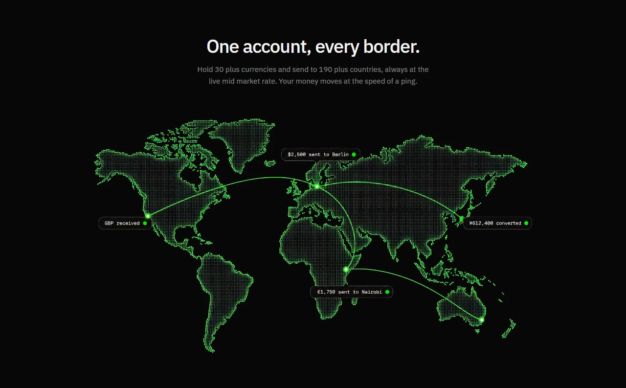
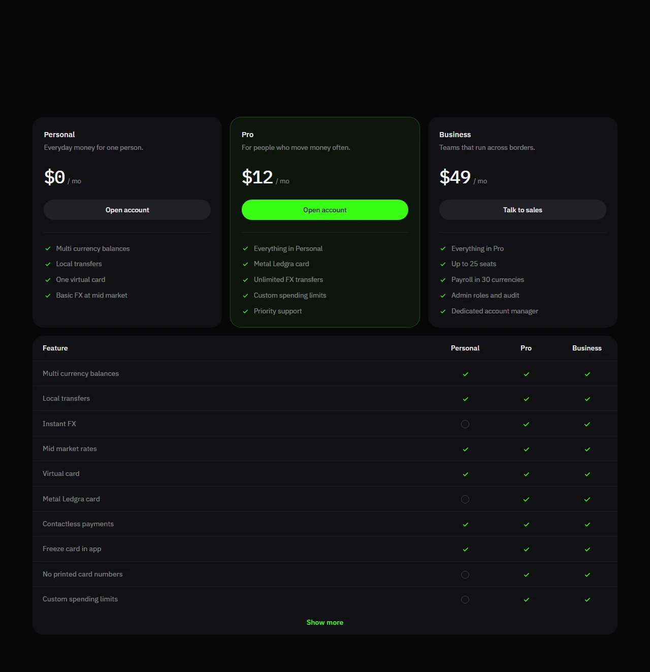
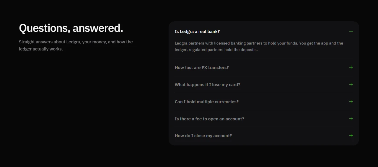
the landing walks that story in chapters. a hero with a strong claim. product features that show balances, currencies, and transfers as quiet phone scenes. a metal card section with accordion details and rotating card art. a coverage map for global reach. trust blocks for encryption and controls. pricing with personal, pro, and business. a dense feature comparison table. faq. a final cta.
visually it sits in a dark register with ibm plex for type and a small star mark. greens show up as accent, not decoration. the site should feel like a ledger you would trust at night, not a neon banking remix.
how i built it
i built ledgra as a static site so the design feedback loop stayed fast. html for structure. css split by section. javascript for navbar behavior, reveals, card slides, accordion, pricing toggle, and the comparison table expand.
the constraint was intentional. no framework, no backend, no fake api. if the story only works after a stack of tooling, the idea was not clear enough yet. shipping a complete marketing surface in plain front end forced every section to earn its place.
account pages exist so the product grammar feels finished. open account and log in are part of the fiction. they are designed, not abandoned placeholders.
design notes
fintech marketing loves urgency, badges, and clutter. i pushed the opposite. fewer claims. sharper hierarchy. enough empty space that a balance can feel important.
the metal card chapter is a centerpiece. gunmetal, a green edge, and copy that explains why nothing sensitive is printed. the coverage section uses a dotted map to sell reach without turning into a globe gimmick. pricing stays honest about the fiction while still teaching how a serious plan table should read.
the comparison table was a craft problem as much as a content one. dense grids get ugly fast. the goal was a table you can scan, not a wall of checkmarks screaming for attention.
what this is not
ledgra is not live software. there is no real ledger, no card issuer, no banking partner behind the faq answers, and no way to open a real account. if you click through expecting a working wallet, you will meet a carefully built demo.
that honesty is part of the piece. the site is here to show design and front end judgment on a hard category: money. the product company is imaginary. the work is not.
outcome
i ended with a complete static marketing world for a fintech idea that only exists on the page. it tightened how i think about dark ui, product copy, and long landing rhythm. ledgra is a personal mock i finished enough to show, clear enough to say out loud that it is not a bank.
disclaimer
The information on this page is provided for general portfolio and informational purposes only. No representation or warranty is made as to its accuracy, completeness, currency, or correctness, and no reliance should be placed on it as advice or as a statement of fact. All content is offered without guarantee and may be updated or corrected at any time without notice.