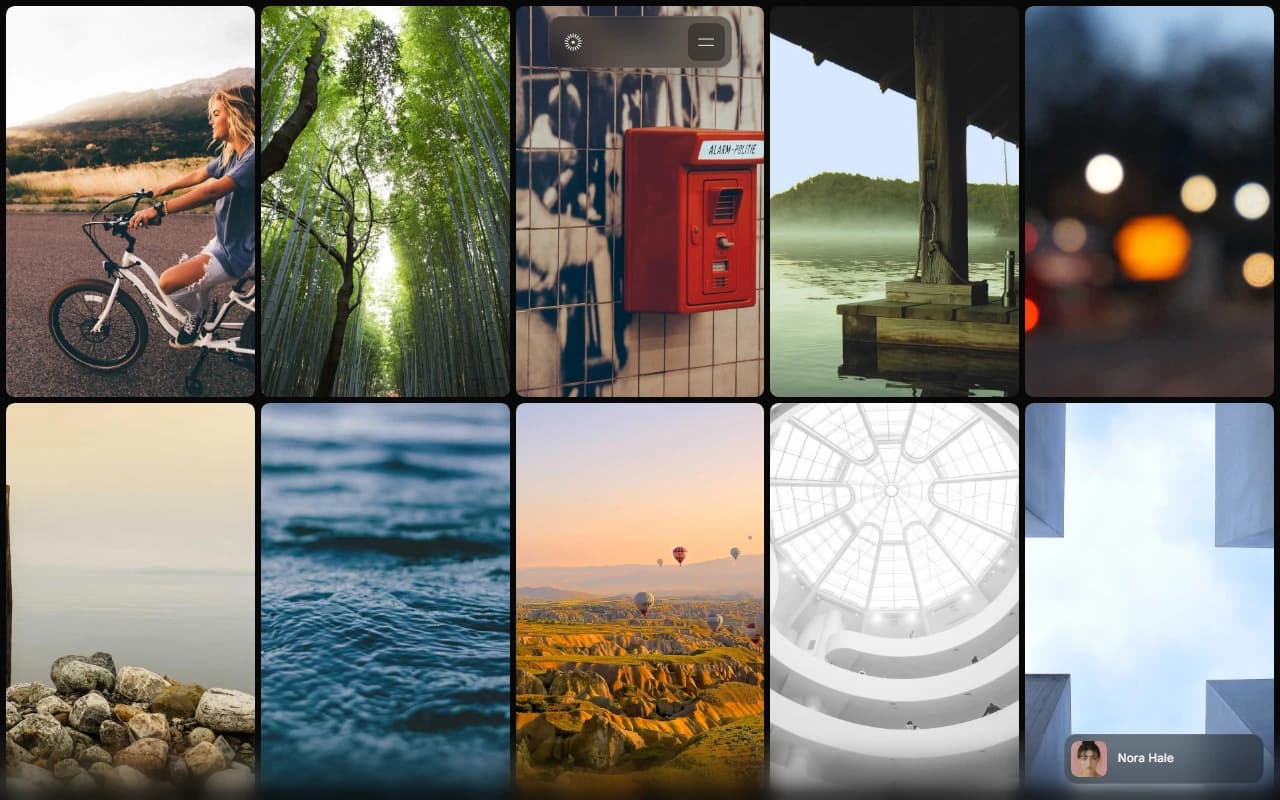
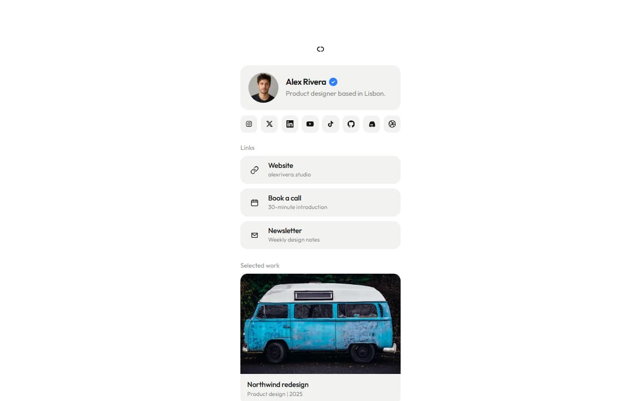
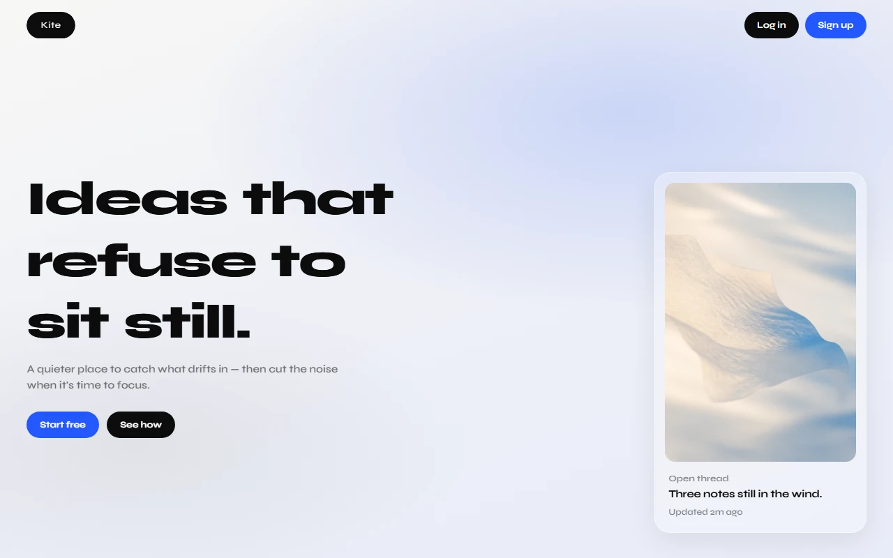
This case study presents a concept demonstration for portfolio purposes. It is not an active commercial product, operating company, or regulated service. The source for this site is available as a free download. You may use it under the license included in the archive. Download here.
loom
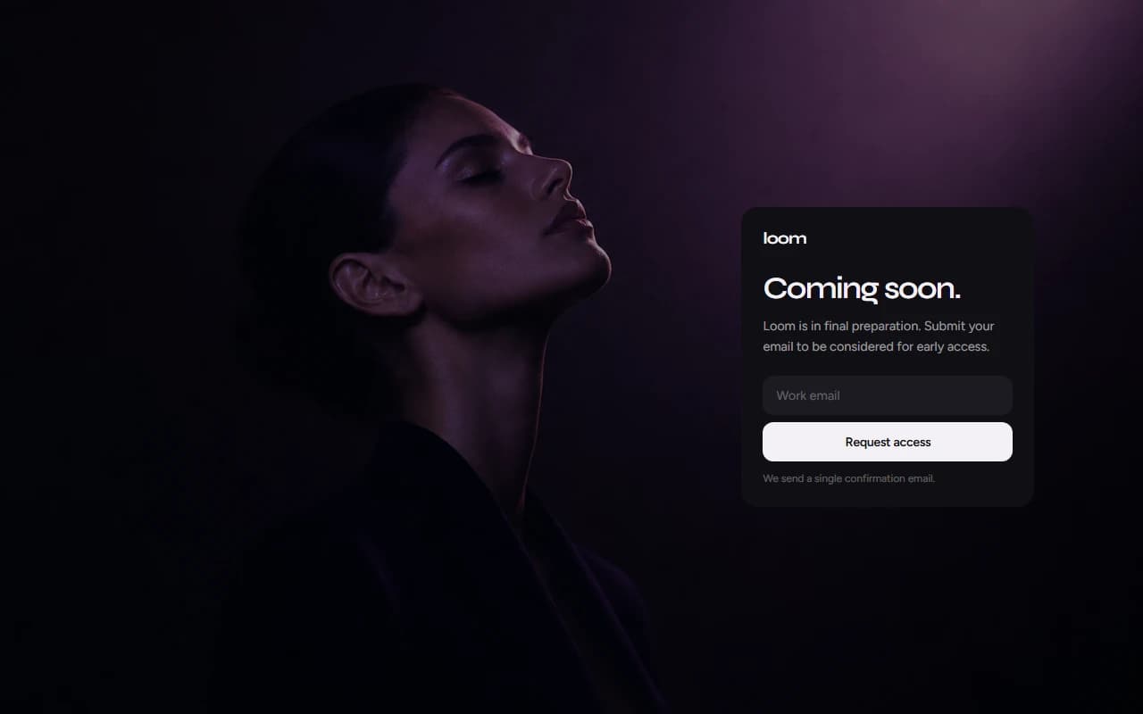
2026personal coming soon page for a fictional early access waitlist. one calm card over photography, email capture, and a quiet confirmation state. a design and front end demo i built, not a live product.
- role
- design & front end
- stack
- html
- css
- javascript
overview
loom is a fictional coming soon site i built as a tight design exercise. one full bleed photograph, one centered card, and a single job: request early access. the product behind it is imaginary. the craft is the point: restraint, type, and a waitlist flow that feels finished instead of temporary.
this is not a shipped product, not a client launch page, and not a real waitlist backend. the form is a designed interaction. the confirmation state is a prop. the page exists to show how a short marketing surface can still feel serious.
what it is
loom presents as a brand in final preparation. visitors land on a soft photographic field, read a short coming soon line, and submit a work email for early access consideration. after submit, the card swaps to a quiet request received state.
that is the whole product story on purpose. no feature grid. no pricing. no long scroll. just brand presence, one action, and enough polish that the fiction feels intentional.
visually it mixes syne for display and figtree for body. the card sits as glass over the image. spacing stays generous so the page can breathe.
how i built it
i built loom as a single static page. html for structure. a small css set for the hero and card. javascript for the waitlist interaction and the success state.
the constraint was extreme focus. if a coming soon page needs a framework to feel real, something is wrong. plain front end kept the loop fast: adjust type, refresh, judge the weight of the card against the photo.
design notes
coming soon pages often look abandoned or over designed. loom aims for the middle: enough structure to feel like a real brand moment, not enough chrome to pretend there is a full product behind it.
the form note stays honest inside the fiction: a single confirmation email. the success state uses a simple check and short copy so the feedback feels calm, not celebratory spam.
what this is not
loom is not live software. there is no real waitlist service, no crm, and no product launching behind the card. if you submit an email expecting access to something, you will only meet a designed demo.
that honesty matters. the page is a portfolio piece about focus and finish on a tiny surface. the company is imaginary. the craft is not.
outcome
i ended with a complete one screen marketing moment for a product that does not exist. it sharpened how i handle waitlist ux, card hierarchy, and photographic heroes. loom is a personal mock i finished enough to show, clear enough to say out loud that it is not a real launch.
disclaimer
The information on this page is provided for general portfolio and informational purposes only. No representation or warranty is made as to its accuracy, completeness, currency, or correctness, and no reliance should be placed on it as advice or as a statement of fact. All content is offered without guarantee and may be updated or corrected at any time without notice.