This case study presents a concept demonstration for portfolio purposes. It is not an active commercial product, operating company, or regulated service. The site shown here is available for purchase in its current form. say hi to discuss availability and terms.
mira
2026personal photography portfolio for a fictional photographer. infinite work grid, project views, about, and contact in a quiet dark system. a design and front end demo i built, not a real studio site.
- role
- design & front end
- stack
- html
- css
- javascript
overview
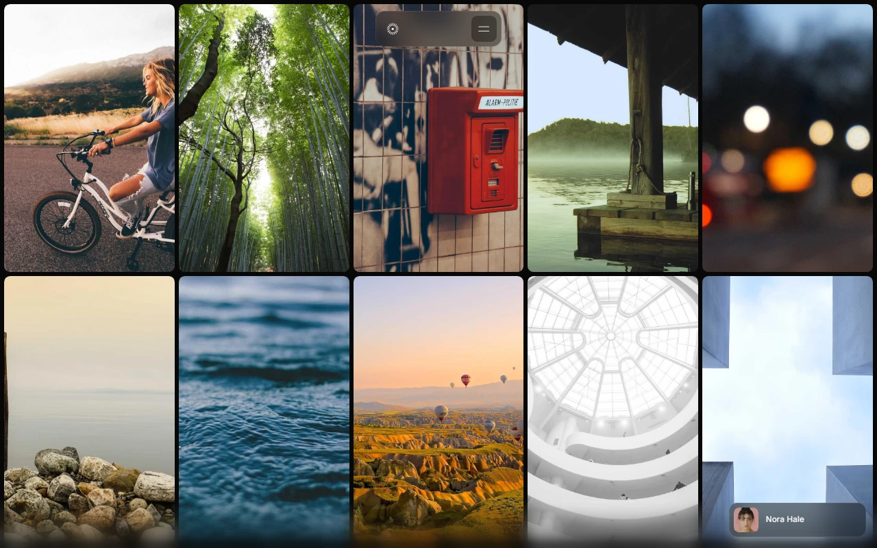
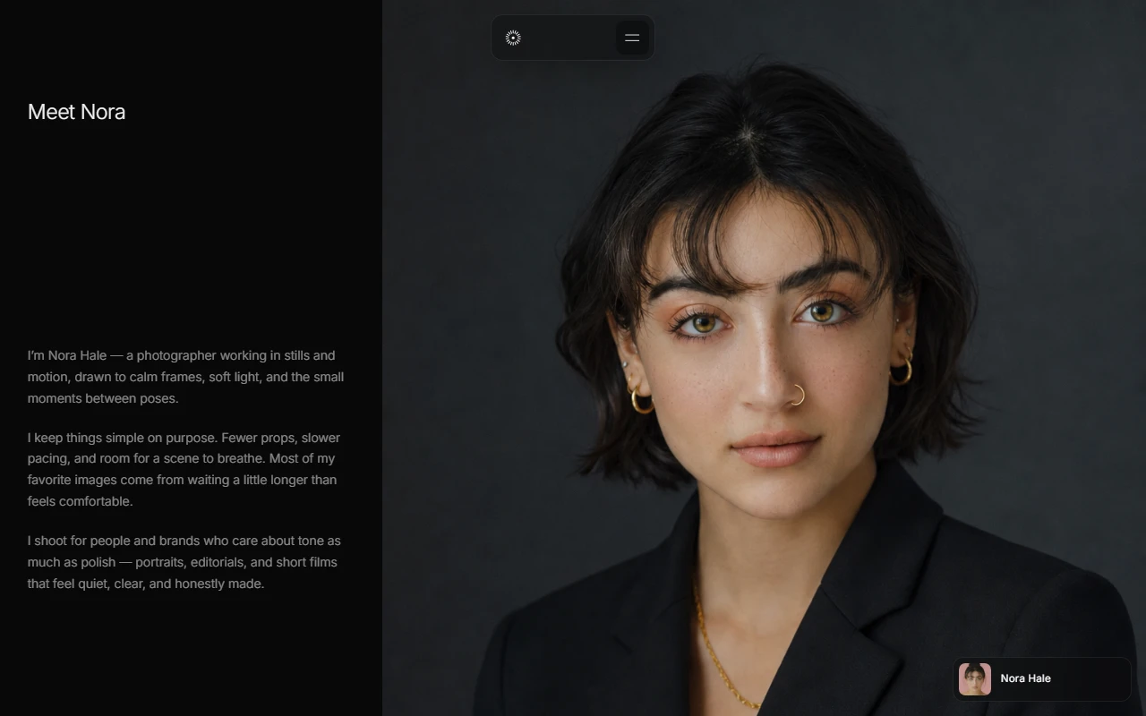
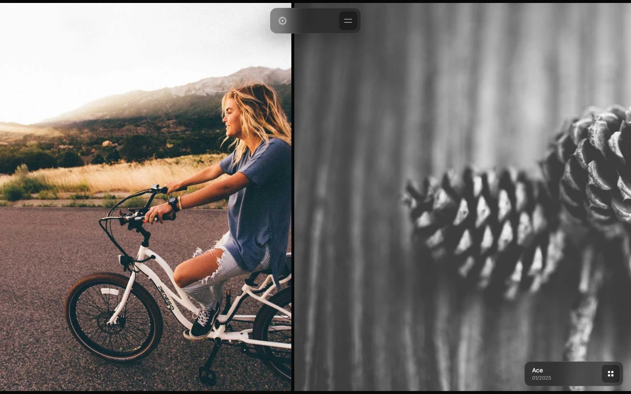
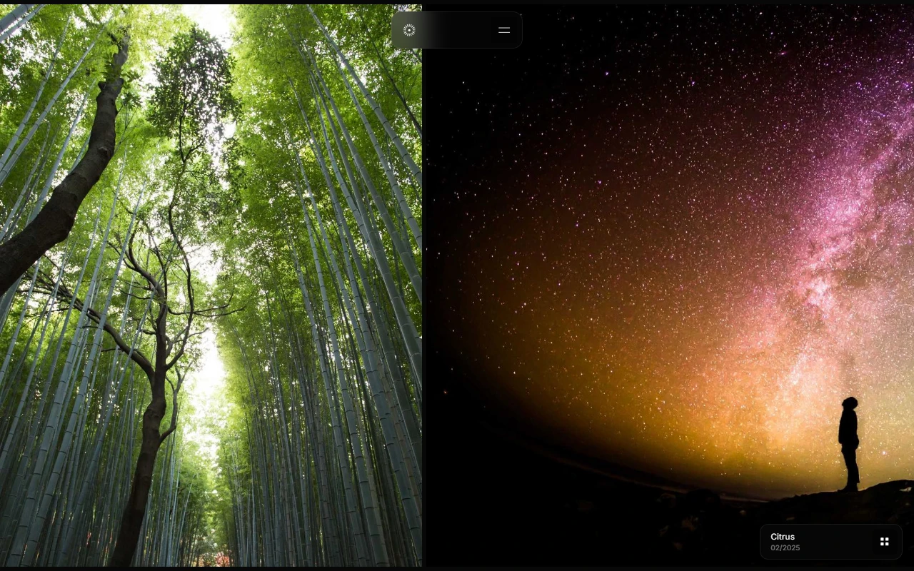
mira is a fictional photography portfolio i built for a made up photographer, nora hale. the site is built around a continuous work grid: images keep moving, projects open into their own scroller, and about and contact stay spare.
this is not a real studio, not a client site, and not a live booking product. the photographer is invented. the project names are invented. the images are placeholders. the craft is the point: calm navigation, an infinite feeling grid, and a portfolio system that stays out of the way of the work.
what it is
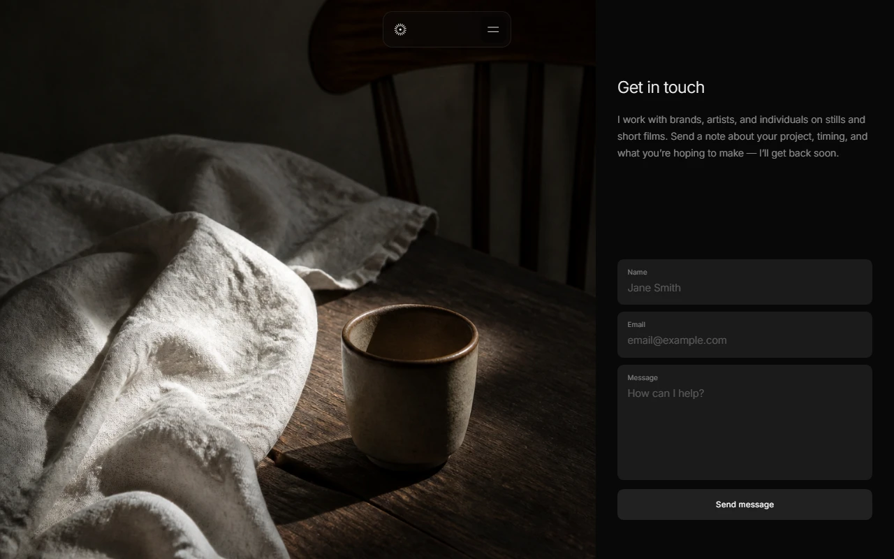
mira presents as a photographer focused on clean, timeless photography and video. the home experience is a dense image grid that scrolls inside its own surface. open a project and the page shifts into a project scroller with its own bar and media. about covers the voice. contact is a direct path to work with me.
the product idea is simple: a photography site that feels like looking through work, not reading a brochure. type stays light. chrome stays minimal. the images carry the page.
how i built it
i built mira as a multi page static site. html for home, about, contact, and project. css by section. javascript for the grid, project routing feel, navbar, and profile panel.
the hard part was the home scroller. the grid needs enough height and recycling behavior to feel endless without becoming heavy. project pages reuse that calm language so moving from grid to detail does not break the mood.
no framework. no cms. that kept the loop fast and forced the interaction model to stay understandable in plain files.
design notes
photography sites often drown in white space or fight the images with loud ui. mira aims for a darker, quieter frame. the nav mark is a small aperture style icon. menus stay short. captions stay soft.
about and contact are intentionally short. the portfolio should prove the taste. the words should not compete with it.
what this is not
mira is not a real photographer website. there is no real booking flow, no real client work, and no real person behind the name. if you treat the grid as a live studio archive, you will only meet a designed demo.
that honesty is part of the piece. the site is here to show portfolio systems for visual work. the persona is imaginary. the craft is not.
outcome
i ended with a complete static photography world for a person who does not exist. it pushed how i handle infinite grids, project transitions, and quiet portfolio chrome. mira is a personal mock i finished enough to show, clear enough to say out loud that it is not a real studio site.
disclaimer
The information on this page is provided for general portfolio and informational purposes only. No representation or warranty is made as to its accuracy, completeness, currency, or correctness, and no reliance should be placed on it as advice or as a statement of fact. All content is offered without guarantee and may be updated or corrected at any time without notice.